
UX Research
UI Design
Web App
CSS
JavaScript
HTML
Creative Coding
Interactive Experience
Mobile
Desktop
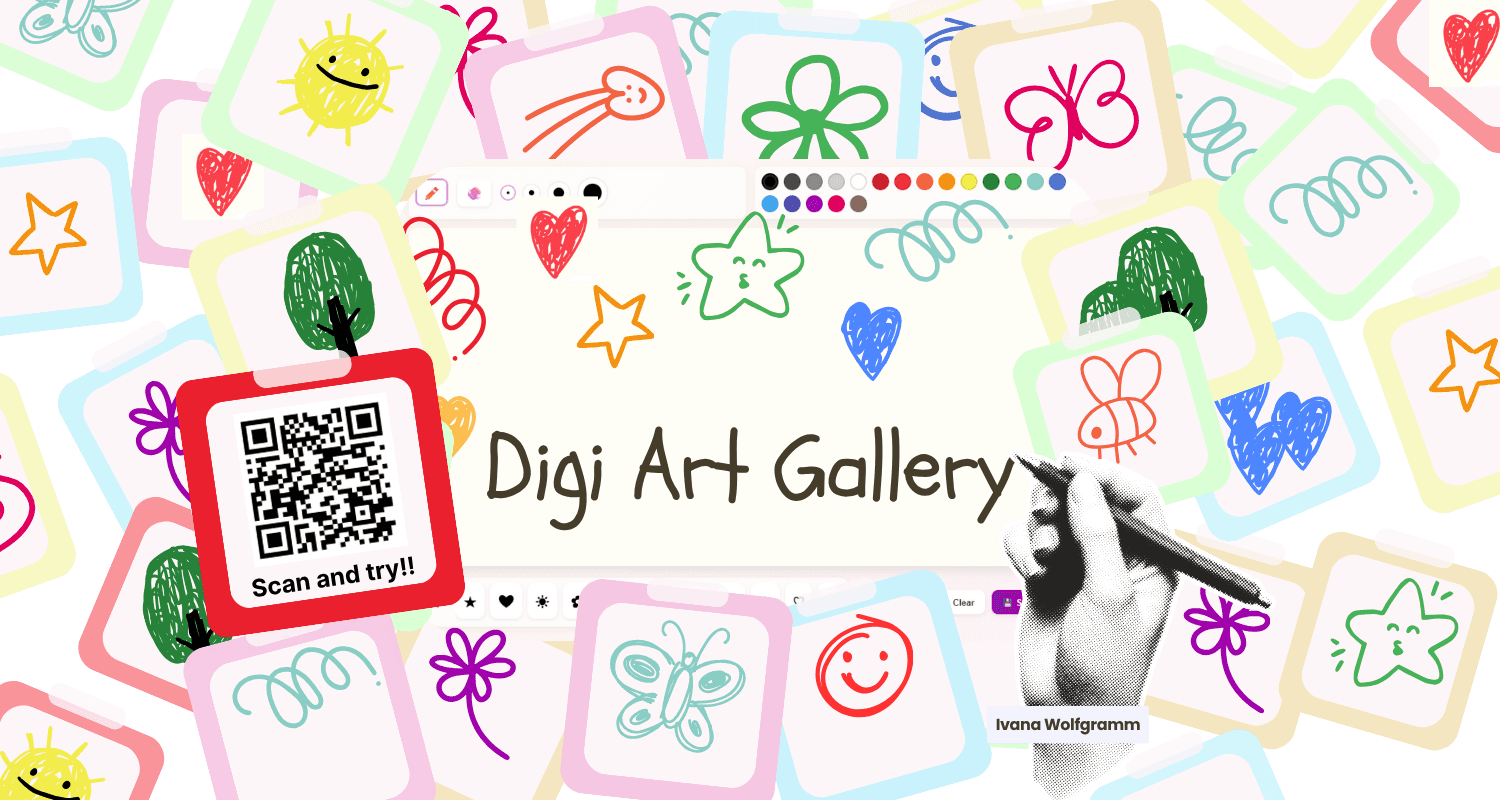
Turning passive waiting moments into playful shared creativity
Click here to see it published on QUTDesign Festival
Project
Role
Tools
Focus
01_Background
A playful web experience for public spaces
Digi Art Gallery explores how playful technology can create small moments of connection in public spaces. Users scan a QR code, draw a response to a prompt and submit their artwork to a shared digital gallery.
The project began with research into loneliness, passive waiting and how public spaces often separate people rather than connect them. The goal was to create a simple interaction that felt quick, safe, anonymous and easy to join.
Challenge
People often move through public spaces with minimal interaction. Even in crowded areas, people can feel disconnected, bored or unsure how to engage with others.
The challenge was to design an experience that could:
Feel easy to join
Work in short waiting moments
Create a visible shared outcome
Encourage creativity
Feel safe and low-pressure
Use technology as support rather than the focus
02_Research
Understanding connection before designing the screen
Loneliness is widespread
People can feel disconnected even in shared public environments.
Crowded spaces can still feel distant
People often turn inward, use their phones and avoid interaction.
Shared experiences build belonging
Simple playful interactions can turn passive spectators into active participants.
DESIGN OPPORTUNITY
How might we foster connection in public spaces for people who might not otherwise interact?
Early Concepts
Digital Wall Gallery
A shared digital wall where user submissions appear as tiles or post-it style artworks.
Loneliness is widespread
People can feel disconnected even in shared public environments.
Chosen Concept: Digital Wall Gallery
The emoji idea was simple, but it limited expression. Drawing gave users more creative freedom and better supported the goal of playful shared connection.
03_Strategy
Choosing a simple interaction model
Notice QR poster
Scan
Draw on a minimal canvas
Submit
See your drawing
View others work
The emoji idea was simple, but it limited expression. Drawing gave users more creative freedom and better supported the goal of playful shared connection.
Core Objectives
Encourage connection
Let users express emotions visually and see shared experiences from others.
Promote creative play
Allow free-form drawing with accessible tools for different skill levels.
Keep it simple
Use minimal instructions and clear actions.
Create a shared gallery
Show drawings together so users can see their work as part of a wider public artwork.
04_User Personas
Choosing a simple interaction model
Amira
Commuting Student
Age 21
Tech Moderate
Location Brisbane
"The wait on my commute feels boring. I wish there was more I could do than wait around."
GOALS
Have something interesting to do while waiting
Use drawing to relax and express how she feels
Feel part of a creative community
Access the experience without needing to sign up
FRUSTRATIONS
Gets frustrated when creative apps feel cluttered
Loses interest if tools lag
Dislikes tools that restrict creative expression
Greg
Retired Teacher
Age 60
Tech Basic
Location Sydney
"I enjoy contributing to digital interactions but find them too complex at times."
GOALS
Share creativity in a simple way
Contribute to community projects
Use tools that are easy to understand
Try something new and meaningful
FRUSTRATIONS
Gets discouraged when technology feels confusing
Finds small buttons and unclear labels frustrating
Feels many public experiences focus too much on younger users
05_Design
Designing for quick, low-pressure creativity
The interface was designed to feel playful, soft and friendly. I used pastel colours, rounded cards, simple buttons and a minimal canvas so the experience would feel approachable for users across different ages and confidence levels.
Drawing canvas
Submit drawing button
Brush size slider
Colour selection
Clear button
Shared gallery view
Key Design Decisions
01
Drawing over emoji selection
The emoji concept was quick, but drawing allowed users to contribute something more personal.
02
No sign-up barrier
User feedback showed that sign-up would discourage participation, so the experience stayed anonymous and low-friction.
03
Prompt-based creativity
A prompt gave users a starting point and made the gallery feel more connected.
02
Mobile-first interaction
Testing showed users preferred drawing on mobile, so the layout needed to work well on smaller screens.
06_Prototyping
Testing tools before building the final version
Let users express emotions visually and see shared experiences from others.
Allow free-form drawing with accessible tools for different skill levels.
Use minimal instructions and clear actions.
Show drawings together so users can see their work as part of a wider public artwork.
WHY HTML/CSS/JAVASCRIPT?
It gave the most control over layout, responsiveness, animation and interaction while keeping the project accessible in a browser.
07_Testing
What users revealed about creative participation
Early concept testing
KEY FINDINGS
Ease of access and anonymity encouraged participation
Users would avoid the experience if they had to sign up
A fun prompt and simple UI made users more likely to contribute
Some users wanted examples before submitting
Visibility and ease of access mattered in public spaces
Prototype testing
Task: "Draw something that made you smile today."
PARTICIPANTS
Ava, commuting student, 21
Josh, commuting adult, 32
Hayley, design student, 20
KEY TAKEAWAYS
Users preferred drawing on mobile
Users enjoyed the playful UI
The minimal interface felt approachable
More tool options were needed
Brush size needed to be more visible
08_Outcome
A functional web prototype for shared creative expression
The final prototype became a browser-based drawing experience with a soft pastel interface, simple canvas tools and a shared gallery layout. Users could open the project in a browser, draw with basic tools, submit their artwork and view drawings in a playful post-it style gallery.
METRIC
FIRST ITERATION
FINAL
CHANGE
Drawing canvas
p5.js test
JavaScript web canvas
↑ Built
Gallery layout
Framer concepts
Post-it gallery style
↑ Refined
Submission flow
Save/upload trial
Direct submit action
↑ Smoother
Browser access
Local prototype
Netlify-hosted link
↑ Shareable
Mobile drawing
Unclear
Preferred by users
✓ Validated
Visual style
Basic interface
Playful pastel UI
↑ Polished
Next improvement
Static/local saves
Live database planned
→ Phase 2
09_Reflection
What I learned from connecting UX, play and front-end development
Digi Art Gallery helped me connect UX research, playful interaction design and front-end development in one project. The strongest part of the project was its simplicity. Users understood the idea quickly and responded positively to the creative freedom.
What worked
01
Exploring multiple concepts helped clarify the strongest direction
02
Testing showed mobile drawing felt more natural
03
Building with HTML, CSS and JavaScript gave full control over interaction
What I'd change
01
Add database integration for live gallery updates
02
Add more creative tools and brush styles
03
Explore ways to spark conversation between participants
04
Run another testing round after live gallery functionality
What Next
01
Database integration
Connect drawings to a live database so the gallery updates across devices.
02
More drawing tools
Add more colours, brush styles, undo options and clearer controls.
03
Conversation prompts
Help users respond to or talk about other drawings.
04
Public display mode
Create a gallery display view for public screens, waiting areas or event spaces.